Monday 23 December 2013

Key Performance Indicator Approaches (Redmond Pie-Gauge)

The "traditional" approach to presenting Key Performance Indicator (KPI) values on a dashboard has been to use circular gauge.  Something like this:


Stephen Few has proposed the Bullet Graph as a much more effective visualization, and I tend to agree with him, but there is just something about circular objects that appeals to people.  Even though we tell them that Pie Charts don't work as well as Bar Charts for a certain visualization, they users demand Pie Charts.  Propose a Bullet Chart and they request a gauge.  I tend to push back on these requests, but not always militantly.  I will allow them because I understand that there is an emotional element within dashboard design that needs to be catered for.

When I do push back though, I like to be able to present alternatives.  Within QlikView, we have several different options for presenting KPI type information.  For example, the data can be presented in a straight table with a linear gauge:


The gauge here is effectively acting as a modified Bullet Graph.  I discuss the creation of this in my QlikView for Developers Cookbook.

Another effective way of presenting this information is by using a horizontal bar chart to display the percentages:


This chart quickly shows the user the relative performance of each country.  The colored blocks show the extent by which a country has exceeded, or failed to reach, the target.

Building a chart like this led me to think about other ways that this could be presented and led to the design of the Redmond "Pie-Gauge" (*** can't find anything like this usage online, but let me know if you have seen it before ***):


This, I think has a couple of things going for it.  Firstly, it works like a good pie chart should - low cardinality part-to-whole comparison.  The circle represents either the total sales or the total target - whichever is higher.  The segments add up to the whole.  It also works as a circular gauge, showing the extent of good performance to the right and sub-target performance to the left.  The size of the segment shows how that plus or minus performance compares to the whole.

So, it gives users the circular objects that they have an emotional attachment to and also gives a reasonably effective visualization.

Personally, I like my new chart design, but it might not be my first recommendation as a gauge alternative.  I quite like this Bar Chart representation:


Here, we can see the percentages as sized blocks versus the actual values.  We can quickly see that although Germany exceeded target by 25%, the Japan 20% represented a much larger actual value.  Similarly, the US 5% drop versus target is actually a much larger dollar value than the UK's 7.1% drop.

I would be interested in hearing other peoples' points-of-view on this subject and what they think about the Pie-Gauge.  Would it be useful for me to follow up with a post on how to create it?


Stephen Redmond is author of QlikView for Developer's Cookbook
He is CTO of CapricornVentis a QlikView Elite Partner. We are always looking for the right people to join our team.
Follow me on Twitter: @stephencredmond

Friday 20 December 2013

Enhanced Store and Drop

A very common use case in QlikView is to load a table, do some transformations, store the table to a QVD file, then drop the table.  If you have many tables in a script, writing out the whole

Store XXX to YYYY.qvd;

and then

Drop Table XXX;

Gets a bit wearing after a while.

My solution is to use a subroutine in the QlikView script like this:

Sub StoreAndDrop(vTableName)

Trace Store and Drop $(vTableName);

// Store the table to QVD
Trace Storing [$(vTableName)] to [$(vQVDPath)\E_$(vTableName).qvd];
Store [$(vTableName)] into [$(vQVDPath)\E_$(vTableName).qvd];

// Drop it
Trace Dropping Table [$(vTableName)];
Drop Table [$(vTableName)];

End Sub

This, very simply, replaces the repetitive code and I can call it like this:

Call StoreAndDrop('Customer');

A perfect use for a subroutine!

Quite often, we might want to capture additional information about the load such as how long the load took and how many records were loaded.  All of this can be captured using the sub routine.  Like this:

LET vTotalTablesLoaded=0; 
LET vScriptStartTime=now(); 
Let vLoadStartTime=now();

Sub StoreAndDrop(vTableName)

Trace Store and Drop $(vTableName);

Let vTotalTablesLoaded=$(vTotalTablesLoaded) + 1;
Let vLoadEndTime=Now();

// if needed
UNQUALIFY *;

TablesLoaded: // replace with join(TablesLoaded) after first table
LOAD
   '$(vTableName)' as [Loaded Table Name],
   NoOfRows('$(vTableName)') as [Number of Records Loaded],
   '$(vLoadStartTime)' as [Load Start Time],
   '$(vLoadEndTime)' as [Load End Time],
   Time(TimeStamp#('$(vLoadEndTime)')-TimeStamp#('$(vLoadStartTime)')) as [Table Load Time]
AutoGenerate (1);

// if needed
QUALIFY *; 
UNQUALIFY [Join_*], [*ID];

// Store the table to QVD
Trace Storing [$(vTableName)] to [$(vQVDPath)\E_$(vTableName).qvd];
Store [$(vTableName)] into [$(vQVDPath)\E_$(vTableName).qvd];

// Drop it
Trace Dropping Table [$(vTableName)];
Drop Table [$(vTableName)];

Let vLoadStartTime=now();

End Sub

Thanks to the very tallented Carly McClintock for inspiring this post.


Stephen Redmond is author of QlikView for Developer's Cookbook
He is CTO of CapricornVentis a QlikView Elite Partner. We are always looking for the right people to join our team.
Follow me on Twitter: @stephencredmond

Wednesday 16 October 2013

Low-cardinality part-to-whole comparison

I came up with this term last week, during a presentation by Bill Lay at the Masters Summit for QlikView in London.

   Low-cardinality part-to-whole comparison

For me, it perfectly describes the correct use of a pie chart.  Let's break it down:

Low-cardinality
In database parlance, this means that a column has few unique values.  For example, a flag field - either 1 or 0 - has only 2 unique values.  An opposite example, high-cardinality, might be Account Number - lots of unique values.

In a pie chart, for me, this means that you need to have a low number of segments.  Really only two or three.  Too many segments makes it hard to discern the differences between them.

Part-to-whole
This is critical for the correct use of a pie chart.  A pie chart is all about ratio - while you are comparing a segment against other segments, the correct context is the size of the segments versus the whole - what is the ratio of one segment versus the others and against the whole.

As an example, if we are looking at sales by country and look at only 3 countries - say Germany, USA and France.  In a pie chart we might see that Germany has about half of the sales.  But the context is just the sales of 3 countries and you can come to the incorrect conclusion that Germany is responsible for half of sales.  Showing all of the sales for all countries - probably restricting to Germany and Others or Germany, USA, France and Others - then we see the whole picture.

If we just want to compare the size of one country's sales versus other countries, then a bar chart is ideal.  The bar chart also works if you can't see all of the countries.  If you only present a sub-set of the countries in a pie chart, the context is incorrect.

So, there you go - low-cardinality part-to-whole comparison.  Feel free to use it in your next presentation.


Stephen Redmond is author of QlikView for Developer's Cookbook
He is CTO of CapricornVentis a QlikView Elite Partner. We are always looking for the right people to join our team.
Follow me on Twitter: @stephencredmond

Tuesday 15 October 2013

Packt Columbus Day Sale

Packt are offering 50% off all eBooks for Columbus Day.

Good opportunity to grab the QlikView Developers Cookbook or the QlikView 11 for Developers in eBook:

Packt - Columbus Day 2014  


Stephen Redmond is author of QlikView for Developer's Cookbook
He is CTO of CapricornVentis a QlikView Elite Partner. We are always looking for the right people to join our team.
Follow me on Twitter: @stephencredmond
Friday 11 October 2013

Bucket analysis by copying states

Alternate States were introduced in QlikView 11.  This allows different objects to be in different selection states.

You can have, for example, 2 list boxes, both with the same field, and both with a different set of selections.

One of the things that this enables a whole new way of "bucket" analysis - allow a user to compare the values from one set of selections against any other set of selections that they may want to make.  It is incredibly powerful.

Many examples that I have seen will have two or three list boxes in each state, side by side, and some chart or set of charts displaying the results.  The reason that you might have only two or three list boxes is really a practical one - there is only so much space on the screen.

My own solution to this is to put the sets of list boxes into containers.  You can then fit many more list boxes for your side-by-side comparison.  However, what if you want to have more than two sets?  If I want to have, say, 4 states that I want to compare then it becomes more difficult to display those and still leave space for the charts.

You can, of course, do some funky stuff with hiding and showing different sets based on a click of a button.  This can be a little confusing so I want to suggest a simpler approach.

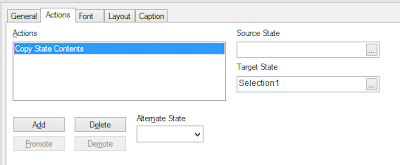
Along with the Alternate States came a couple of new Actions - Swap State Contents and Copy State Contents.  So, my approach is to have only one set of selections, that are in either their own State or event the default state, and make my selections in these.  I can then have a button to Copy State Contents from the list boxes to the State that I want them in.


The screen shot shows the Action setup to copy the state contents from the "Default" state (blank) to a state that I have setup called "Selection1".

I would have this action attached to a button called "Save Selection 1" (or something that will make sense to my users) and then have some charts that will show this versus Selection2, Selection3, etc.

To extend a model that uses Show/Hide boxes means having to do quite a bit of work.  To extend this model means adding one new button.


Stephen Redmond is author of QlikView for Developer's Cookbook
He is CTO of CapricornVentis a QlikView Elite Partner. We are always looking for the right people to join our team.
Follow me on Twitter: @stephencredmond
Thursday 10 October 2013

Flags and Dual values in Set Analysis

To avoid having to create very complex Set Analysis, it can be quite a good idea to create flags in your script.  Doing the complex calculation in the script to create a simple 1 or 0 value means it happens once - when your users are not involved - and makes the front end calculations a lot quicker - when your users are involved.

Sometimes we want to dual-purpose that flag field.  As well as having the value of 1 or 0, we want to allow the users to select the field.  "1" and "0" are not very friendly so we want to have the users click on something like "Yes"/"No" or "True"/"False".  There are a few ways of achieving this:

1.  Just create the 1 or 0 in the script and in the front-end use an Expression in the list box like:

   If(Flag=1, 'True', 'False')

This works fine but, of course, is putting some calculation back into the front-end.  While it is not an arduous calculation, it will re-calculate on all selections so it does add some clock cycles.  It also makes no impact on how you would use the value in Set Analysis so I don't need to worry about this option any further in this post.

2.  Create the 1 or 0 in the Flag field and create a 2nd field (e.g. Flag_Text) with the text values that you want.  The user gets to select the value from Flag_Text, but we use the Flag value in Set Expressions.

There are a couple of issues with this.  First off, it adds additional overhead in the Script because we need to do the same calculation twice and create 2 fields.  Secondly, if we use the Flag value in a Set, we need to ensure that we also exclude the Flag_Text value from that set:

   Sum({<Flag={1}, Flag_Text=>} Sales)

There is also the possibility that a user using collaboration features might add the Flag field as a list box and that might cause confusion.

3.  Instead of creating the values as 1 or 0, we create Dual values:

   ...
   If(Condition=True, Dual('Yes',1), Dual('No',0)) As Flag,
   ...

This is more efficient because everything happens in the script and we are only creating the one field there from one piece of code.

There is a complication though in your Set Analysis.  You would like to do something like this:

   Sum({<Flag={1}>} Sales)

But it will now fail!  This is because the set comparison always compares against the text value of a dual (except for Dates - more of that below).  That means that you would have to use:

   Sum({<Flag={'Yes'}>} Sales)

Of course, this is a text comparison so will not execute as efficiently as a numeric one.  What can we do?

Well, we can force the calculation to be numeric by using a search syntax instead of the actual value and that search should involve > or <.  For example:

   Sum({<Flag={">0"}>} Sales)

Will work!

Interestingly, this does not work immediately with a date value that has been created with one of the date functions (like Date(), MakeDate, etc.)  I am not totally sure of why but I suspect that this is handled differently because the system recognizes it as a date (so it understands what ">2/6/2013" means) and doesn't handle the same way as other numeric Duals.

This means that we often need to add formatting into a date set to get it to work.  Like this:

   Sum({<Date={$(=Date(vDate,'M/D/YYYY'))}>} Sales)

We can override this and make our dates handle like other Duals by loading them as a Dual explicitly in the Script.  Instead of this:

   ...
   Date(date_field) As Date,
   ...

We can do this:

   ...
   Dual(Date(date_field), Num(date_field)) As Date,
   ...

Have fun!


Stephen Redmond is author of QlikView for Developer's Cookbook
He is CTO of CapricornVentis a QlikView Elite Partner. We are always looking for the right people to join our team.
Follow me on Twitter: @stephencredmond

Monday 16 September 2013

Dynamic ApplyMap

I use ApplyMap all the time in QlikView scripts.  It is one of the best ways of getting data from a lookup table - especially with the facility to specify a default value.

I use it so much that I often forget about one quite useful aspect of it - the name of the mapping table is provided as a text value.  Usually this means that I am passing a literal string, but it can also mean that I can pass a dynamically calculated string - use a different map for different values.

In the scenario below, we have a currency table with a value per month.  Often the approach might be to join this table to the fact table and then do a second load to calculate the base value (or even not bother and handle that in the front-end).

You could, of course, just concatenate a number of fields to create a key for mapping, but I prefer a different and, I think, more elegant method.

In this this example, I load the currency table into multiple mapping tables and then dynamically pick the right mapping table while loading the fact table:

Monthly_Exchange_Rates:
Load 
Currency, 
Num(Date#(Month, 'YYYY-MM')) As Month,
Rate
Inline [
Currency, Month, Rate
EUR, 2013-05, 1
EUR, 2013-07, 1
EUR, 2013-06, 1
EUR, 2013-09, 1
EUR, 2013-08, 1
GBP, 2013-09, 0.842711
GBP, 2013-05, 0.848677
GBP, 2013-06, 0.851957
GBP, 2013-08, 0.858893
GBP, 2013-07, 0.862144
USD, 2013-05, 1.297799
USD, 2013-07, 1.307939
USD, 2013-06, 1.317866
USD, 2013-09, 1.323692
USD, 2013-08, 1.331518
CNY, 2013-05, 7.972392
CNY, 2013-07, 8.027845
CNY, 2013-06, 8.088211
CNY, 2013-09, 8.100795
CNY, 2013-08, 8.151601
];

Temp_Curr:
Load Distinct Currency as Currency_List
Resident Monthly_Exchange_Rates;

For i=0 to FieldValueCount('Currency_List')-1
Let vCurr=Peek('Currency_List', $(i), 'Temp_Curr');

Exch_Rate_Map_$(vCurr):
Mapping
Load Month, Rate
Resident Monthly_Exchange_Rates
Where Currency = '$(vCurr)';

Next

Drop Tables Temp_Curr, Monthly_Exchange_Rates;


SalesTable:
Load
*,
Sales_Local/ExRate as Sales_Base;
Load
Date,
Country,
Currency,
Sales as Sales_Local,
ApplyMap(
'Exch_Rate_Map_' & Currency, 
Floor(MonthStart(Date)), 

1) as ExRate
Inline [
Date, Country, Currency, Sales
2013-05-02, Ireland, EUR, 123
2013-05-13, Ireland, EUR, 322
2013-06-11, France, EUR, 343
2013-07-02, USA, USD, 343
2013-08-12, UK, GBP, 233
2013-08-30, China, CNY, 223
2013-09-01, UK, GBP, 543
2013-09-24, USA, USD, 412
];

It's common enough to come across a scenario like this, so I hope you find it useful.


Stephen Redmond is author of QlikView for Developer's Cookbook
He is CTO of CapricornVentis a QlikView Elite Partner. We are always looking for the right people to join our team.
Follow me on Twitter: @stephencredmond

Wednesday 26 June 2013

Win a copy of QlikView for Developers Cookbook

Packt have kindly agreed to give away 2 copies of my book.  See the competition page for details:

http://www.qliktips.com/p/competition.html


Stephen Redmond is author of QlikView for Developer's Cookbook
He is CTO of CapricornVentis a QlikView Elite Partner. We are always looking for the right people to join our team.
Follow me on Twitter: @stephencredmond

The one that got away - linking Section Access to multiple dimensions

During the writing of QlikView for Developer's Cookbook, I added a new recipe quite late on but, for one reason or another, it never made it into the final cut.

So, what we have done is to publish this recipe as an article on the Packt website:

   Linking Section Access to multiple dimensions

I hope that you find it useful.


Stephen Redmond is author of QlikView for Developer's Cookbook
He is CTO of CapricornVentis a QlikView Elite Partner. We are always looking for the right people to join our team.
Follow me on Twitter: @stephencredmond

Monday 24 June 2013

Recipes for success

The new book should be ready to purchase in the next couple of days via the Packt site:

http://www.packtpub.com/qlikview-developers-cookbook/book

and shortly thereafter via Amazon, Barnes & Noble and all the usual suspects.

I though that I would publish a list of the recipes that are in the CookBook so that all can see what you are getting.

1.  Charts

- Creating custom pop up labels in a bar chart
- Creating a box plot chart for a simple data set
- Using the wizard to create a box plot chart
- Creating a "Stephen Few" bullet chart
- Creating a modified bullet chart in a straight table
- Creating a bar chart in a straight table
- Creating a Redmond Aged Debt Profile chart
- Creating a waterfall chart
- Replacing the legend in a line chart with labels on each line
- Creating a secondary dimension in a bar chart
- Creating a line chart with variable width lines
- Brushing parallel coordinates
- Using redundant encoding with a scatter chart
- Staggering labels in a pie chart
- Creating dynamic ad hoc analysis in QlikView

2.  Layout

- Changing the default object layout options
- Changing the default selection color scheme
- Modifying the green, white, and gray selection color schemes
- Modifying the green, white, and gray selection color schemes on QlikView Server
- Using containers as an alternative to multi-boxes
- Using the design menus to custom format a cell

3.  Set Analysis

- Using dollar expansion in Set Analysis to enable from-date and to-date selection
- Using alternate states with Set Analysis
- Using Set operators to exclude values from results
- Using Set Analysis with a Date Island
- Using Sets to avoid key tables

4.  Advanced Aggregations

- Using TOTAL to calculate the percentage of total and the percentage of subtotal
- Using AGGR to calculate the percentage of the maximum value
- Using AGGR to resolve a "Sum of Rows" issue
- Creating a dynamic AGGR expression for a Group dimension using Dollar Expansion
- Using RangeMax to return only positive numbers
- Creating a dynamic Part-to-Whole pie chart
- Creating a colored treemap using colormix
- Using RangeSum to calculate a rolling total in a multi-dimension table
- Showing only the top 3 values in a pivot table
- Creating a Statistical Control Chart using Standard Deviation
- Creating a Moving Range chart
- Creating a Control Chart using Moving Range

5.  Advanced Coding

- Extracting QlikView data to a Word report
- Printing reports to PDF using PDFCreator
- Creating a chart using a macro
- Using VBS functions in charts

6.  Data Modeling

- Concatenation of fact tables to avoid loops and synthetic keys
- Creating a Key/Link table in QlikView

7.  Extensions

- Creating a simple HTML extension
- Creating a simple HTML table
- Creating an interactive extension
- Using external libraries with extensions

8.  Useful Functions

- Handling null in numeric fields or calculations
- Using Dual to handle period name sort
- Parsing text to numbers and dates
- Calculating Year To Date dynamically
- Labelling a pie chart to replace the legend
- Calculating the lowest or highest value in a range
- Consolidating a date-time value into quarter hourly segments
- Dynamically filtering by From/To dates

9.  Script

- Creating flags in the script
- Replacing IsNull
- Storing and dropping using a subroutine
- Keeping a trace on things
- Using AND Mode in listboxes
- Using Exists and Keep to limit the data load
- Setting the default display format
- Setting the default sort order
- Matching financial periods to dates
- Handling partial reload in the script
- Using Peek and Previous to calculate against loaded records
- Creating a simple Gantt for a dashboard using Interval Match
- Reading users from Active Directory
- Getting a sub-URL using the Table wizard
- Using parameters in Dollar Sign Expansion
- Removing fields with a wildcard
- Handling multiple subfolders in a script

10.  Improving Performance

- Reducing the number of distinct values
- Creating counter fields to avoid Count Distinct
- Creating flag fields to avoid Sum of If and other inefficient expressions
- Denormalizing for performance

11.  Security

- Section Access Gotcha's
- Blocking user access to a field using OMIT
- Making all values available to Admins

There was one additional Security recipe that didn't make it into the final cut - Linking Section Access to multiple dimensions.  This will be released as a free article on the Packt website.


Stephen Redmond is author of QlikView for Developer's Cookbook
He is CTO of CapricornVentis a QlikView Elite Partner. We are always looking for the right people to join our team.
Follow me on Twitter: @stephencredmond

Wednesday 12 June 2013

Squeaky bum time

Sir Alex Ferguson, the most successful football manager in history, often had an interesting turn of phrase.  One of his most famous was the description of that time at the end of season where everyone started to get nervous and excited at the same time - he called it "squeaky bum time".

Well, we are at that stage with my new book!  All of the final drafts are in, the cover design is agreed and the Packt website is now up:

http://www.packtpub.com/qlikview-developers-cookbook/book

It's even listed on Amazon:

http://www.amazon.com/QlikView-Developers-Cookbook-Stephen-Redmond/dp/1782179739

I am just waiting now for the pre-final draft layouts.  Once all are agreed, then the book will be sent to the printers for publication.  Once it is sent off, it should be available within 6-7 days.

Would love to see it available before the end of June!

I want to take an opportunity to thank the technical reviewers - Barry Harmsen, Mike Garcia, Ralf Becher, and Steve Dark.  All of these guys have a huge amount of QlikView experience and their comments and suggestions have really helped to round the edges of this book.  They are all awesome!


Stephen Redmond is CTO of CapricornVentis a QlikView Elite Partner. We are always looking for the right people to join our team.
Follow me on Twitter: @stephencredmond

Monday 13 May 2013

YearToDate function in Lua for QlikView Expressor

This is a good function to have around and one that is useful to demonstrate being able to have optional parameters in functions.  We just need to check that a parameter is not nil.  If it is, we can set a default value.

Here is the code:


function inyeartodate(vdate, vbasedate, vshift)

   -- Accept a date and compare it to the base date
   -- If it is in the same year up to and including the
   -- basedate, then true.  The shift changes the
   -- year to compare.  E.g. -1 is YTD last year.

   rval = 0

   -- The parameters may not have been passed so establish defaults
   if vdate == nil or not is.datetime(vdate) then vdate = datetime.timestamp() end
   if vbasedate == nil or not is.datetime(vbasedate) then vbasedate = datetime.timestamp() end
   if vshift == nil or not is.number(vshift) then vshift = 0 end
   
   -- In case the shift is not an integer, floor it
   if not is.integer(vshift) then vshift = math.floor(vshift) end

   -- If the vshift is not zero, we ajust the base date
   if vshift ~= 0 then vbasedate = datetime.adjust(vbasedate, vshift, "y", true) end

   -- If the vdate is less than the base date, 
   -- and they are in the same year, then
   -- the result is true - return -1
   if vdate <= vbasedate and datetime.moment(vdate, "y") == datetime.moment(vbasedate, "y") then
      rval = -1
   end

   return rval

end


And you might call it like:


d = string.datetime("20120514", "CCYYMMDD")
b = string.datetime("20130531", "CCYYMMDD")

print (inyeartodate(d))
print (inyeartodate(d, b, -1))


Another interesting thing to note is the "true" parameter to the datetime.adjust function.  This causes the function to use 365 days in the calculation rather than 365.25.


Stephen Redmond is CTO of CapricornVentis a QlikView Elite Partner. We are always looking for the right people to join our team.
Follow me on Twitter: @stephencredmond

Month function in Lua for QlikView Expressor

Lua doesn't have a Dual data type like QlikView's.  However, it does have a native Table data type that could allow us to simulate a Dual.  At the end of the day, you are still going to have to the different values as separate outputs, but it could be useful to have a simple function that will give you one or the other.

Here you go:


function month(vdate)


   rval = nil
   
   -- Set up a table of Month names
   local months = {"Jan", "Feb", "Mar", "Apr", "May", "Jun", "Jul", "Aug", "Sep", "Oct", "Nov", "Dec"}

   if is.datetime(vdate) then
      -- Get the month number using datetime.moment
      local monthnum = datetime.moment(vdate, "m")
      
      -- Return a table of the Text and Num values
      rval = {Text = months[monthnum], Num = monthnum}
   end

   return rval


end


This would be called something like this:


d = string.datetime("20130513", "CCYYMMDD")

print (month(d).Text, month(d).Num)


Enjoy.


Stephen Redmond is CTO of CapricornVentis a QlikView Elite Partner. We are always looking for the right people to join our team.
Follow me on Twitter: @stephencredmond

AddMonths function in QlikView Expressor

QlikView Expressor comes with a programming language, called Lua, to which they have added their own objects and functions.  One of these is the datetime object which has several functions to allow the manipulation and parsing of dates - something that will be done in an ETL environment quite frequently.

One of these function is adjust - used to add or subtract different time periods from a date.  When looking at the documentation, there was an interesting, to me anyway, omission in the type of period that you can adjust a date by.  It does include seconds, minutes, hours, days, years and centuries, but no months!

Now, month arithmetic should be straightforward but there are complications when you have dates after the 28th of any month - what happens if you subtract 3 months from the 29th May 2013?  If you don't handle it correctly, you will get an invalid date.

In this Lua function, I handle that eventuality by using a Lua pcall function to test if the returned date is valid and, if not, subtracting a day until it is.


function AddMonths(dt, months)

    -- Parse the month, year and day of the date
    mn = datetime.moment(dt, "m")
    yr = datetime.moment(dt, "y")
    dy = datetime.moment(dt, "d")
    
    -- Add the number of months to the month
    mn = mn + months

    -- If this resulted in a month value over 12,
    -- then we increment the number of years and
    -- decrease the month value by 12 until it is
    -- less than 12 again
    while mn > 12 do
       mn = mn - 12
       yr = yr + 1
    end
    
    -- Similarly, if the calculation leaves us
    -- less than zero, we need to subtract years
    while mn < 1 do
       mn = mn + 12
       yr = yr - 1
    end

    -- If the day value is over 28, the convert might not parse so we drop the number
    -- of days until it does (e.g. starting with 31st May, subtract 3 months gives
    -- Feb - 31st Feb is an error so we need to go back to 28th Feb)
    if dy > 28 then
       -- Wrap the call in a pcall() to test if it works - if it fails, we subtract a day
       while not pcall(function() string.datetime(mn .. "/" .. dy .. "/" .. yr, 'M*/D*/YYYY') end) do
          dy = dy -1
       end
       rval = string.datetime(mn .. "/" .. dy .. "/" .. yr, "M*/D*/YYYY")
    else
       rval = string.datetime(mn .. "/" .. dy .. "/" .. yr, "M*/D*/YYYY")
    end

    return (rval)

end


So, you would call it something like this:


bd = string.datetime("20130529", "YYYYMMDD")

print(datetime.string(AddMonths(bd, -3), "CCYY-MM-DD"))


This may not be be most efficient way to do this, but it is a useful demonstration of using pcall and doing month arithmetic.


Stephen Redmond is CTO of CapricornVentis a QlikView Elite Partner. We are always looking for the right people to join our team.
Follow me on Twitter: @stephencredmond

Wednesday 1 May 2013

Bricks on maps instead of circles

In his recent newsletter, Stephen Few introduces the concept of using bricks as "A New, More Perceptible Method for Encoding Quantitative Values in Geospatial Displays".

Now, I am not a fan of geospatial data visualizations at the best of times and have blogged and tweeted about that in the past (for example, see Do we really need maps for analysis?)  I particularly don't like the ideal of using bubble size to encode value on a map so the idea the bricks might be a better idea was intriguing.

Stephen uses a map of the US and juxtaposes the use of bricks with another map using circles to contrast.  It is quickly obvious that the bricks are much easier to compare, say, Washington State with Florida.  With the circles it is difficult to perceive the difference.  With the bricks, one can see the difference easily.

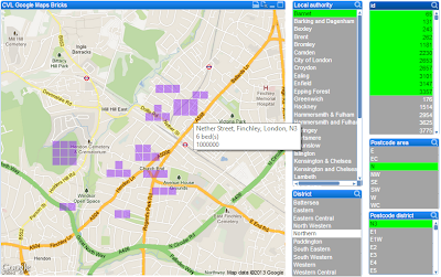
Inspired by Stephen, and challenged by Brian Dunphy on Twitter, I decided to have a go at doing this in QlikView.  It was a fair challenge and helped me build up some skills with using the jQuery library (which is embedded with QlikView in version 11+ so you don't need to load it separately).  Here is the result (using the old QlikView Google Maps demo document of London properties):


Not bad!  But I quickly noticed a problem with this application, which Stephen mentions in his article. When circles overlap, they are still legible.  When the bricks overlap, they become completely unreadable!


So, it can work quite well where the data points are spread apart, but not great where there is overlap.  I think that if you are doing something for states / provinces / countries, where the data points are more distinct and can be controlled, then this can be useful.  But I might still choose a bar chart!


Stephen Redmond is CTO of CapricornVentis a QlikView Elite Partner. We are always looking for the right people to join our team.
Follow me on Twitter: @stephencredmond

Tuesday 23 April 2013

Performance using Labels or Column() in charts

If I have a chart that calculates Total Sales: Sum(Sales), and Total Costs: Sum(CostPrice*Quantity), then I have 3 options to calculate the Total Margin:

Option 1:  I can just use the same expressions in full:
Sum(Sales) - Sum(CostPrice*Quantity)

Option 2:  I can reference the column values using the Column() function:
Column(1)-Column(2)

Option 3: I can reference the labels of the first expressions:
[Total Sales] - [Total Costs]

Now, someone once said to me that the last option, although it might appear to be the best because you are re-using existing values, actually calculates slower than the others.  I have often wondered if that was true.  Someone else suggested to me recently that the 2nd option actually performs quicker.  I decided that I should find out!

Buried deep in the Document Properties of a QVW, on the Sheets tab, there is a list of all the objects on the sheet along with their last calculation time (CalcTime) in milliseconds.  If you looked at this for one of your charts, you might find that it says "0".  This is because the last calculation might have been from cached data so the only accurate CalcTime is when the chart is first initialized in QlikView or when the first of a particular set of selections are made in a recently opened document - where the cache has not been established yet.

So, what I did was to take a document with about 5,000,000 sales transaction rows and build a simple Straight Table of Sales / Costs / Margin by Country.  I made 3 copies of this document, each copy making the Margin calculation in one of the above ways.  The only object in each document is the straight table.

I then completely closed QlikView.  I opened one of the documents, recorded the "Initialize" CalcTime for the chart, made a selection of 2 countries (UK and USA) and recorded the "Selection" CalcTime for the chart.  Then I shut down QlikView again and repeated.  I did this 8 times for each of the documents, opening them in random order.

Here are the results:

Option 1Option 2Option 3
InitializeSelectInitializeSelectInitializeSelect
219125219125219125
250140250125202125
234125265156203124
218125219125218125
250125218141218140
219125281156250156
234141218141219140
219125218125297141
Mean230.4128.9236.0136.8228.3134.5
Mode219.0125.0218.0125.0219.0125.0
Median226.5125.0219.0133.0218.5132.5

There is some slight differences.  But, statistically, I would have to say that there is no real difference between the 3 options!

One thing that I would say is that I don't like using the Column() function in a Straight Table.  This is because the user may have the option to swap columns around and that would invalidate the expression.  Other than that, it appears that you can just use whatever option you like and it won't make any difference to QlikView performance.


Stephen Redmond is CTO of CapricornVentis a QlikView Elite Partner. We are always looking for the right people to join our team.
Follow me on Twitter: @stephencredmond

Old home, new address - Welcome to qliktips.com

I have been thinking about this for a while and decided that there was no reason not to "brand" my blog a little.  So, welcome to qliktips.com.

The site is still hosted by BlogSpot.com (Google) and all the old content is still available and all the old links are still working.


Stephen Redmond is CTO of CapricornVentis a QlikView Elite Partner. We are always looking for the right people to join our team.
Follow me on Twitter: @stephencredmond

Wednesday 17 April 2013

Coming soon, to a bookstore near you...

Today is a significant milestone for me.

Back in January, I was approached by Packt Publishing to author a book for them.  They wanted to follow up on the success of Barry and Mike's QlikView 11 for Developers with an addition to their Cookbook series.

A Cookbook is something very different than Barry & Mike's excellent book.  Their book is an excellent instructional manual for teaching beginners, and even more experienced developers, how to create QlikView applications.  They start at the basics and move through the book to the more advanced subjects.

Like an actual cookery book, I will assume that the user knows how to do certain things, like how to create a new QlikView document and edit the script.  I will say, "edit the script", in the same way that the cookery book will say, "preheat the oven to 350F", and I will assume that you will know how to do that.

The Cookbook will be a collection of self-contained recipes collected in broad categories.  You don't need to read the book from start to finish, a user can dive into any recipe without having to have completed any before (mostly!)

Right now, the categories are:

- Charts
- Layout
- Set Analysis
- Advanced Aggregation
- Advanced Coding
- Data Modelling
- Extensions
- Useful Functions
- Script
- Improving Performance
- Security

Some categories only have a couple of recipes, some have many.  Right now, there is a total of 79 recipes.  This could, of course, change before publication.

Today is significant because I have just delivered the final first draft to the publishers.  Now, this doesn't mean that the book will be in the stores next week, but it is a significant step along the way.

The next few months will, I am sure, be interesting, but I can't wait.


Stephen Redmond is CTO of CapricornVentis a QlikView Elite Partner. We are always looking for the right people to join our team.
Follow me on Twitter: @stephencredmond

Monday 18 February 2013

What is a "Data Scientist" and how do I become one?

I read an interesting post yesterday by Daniel Tunkelang of LinkedIn called "Data Science: What's in a name".

Essentially, a Data Scientist is someone who applies the scientific method - explore, hypothesize, test, repeat - to data.  This is probably what a lot of "QlikViewers" and other "data discovery" (Tableau, Spotfire, etc.) experts think they do.  But there are potential gaps that need to be considered.

Daniel introduces the Data Science Venn Diagram from Drew Conway in his article:


My experience is that a lot of data discovery experts come from an IT background - databases, reporting, etc.  Very much a "computer science" type of person.  They may have built up a lot of the substantive expertise in many areas of business and probably have a great set of "hacker" skills that they have built up over the years, but perhaps a lack of the core statistical skills or understandings.

This is where I found myself over the last number of years.  I have a great range of "hacking" skills and abilities to be able to get at data and get it into a form that I can use it to answer the business questions where I can apply my built-up business expertise.  But Drew Conway identifies this as "Danger Zone!" on his venn diagram - someone who knows enough to be dangerous.

I think that I recognized this in myself a while ago, so decided to take action.  Starting with just reading - I highly recommend How to Lie with Statistics by Darrell Huff - and then moving on to taking Statistics One on Coursera.  I even find that regularly listening to More Or Less from BBC Radio 4 is an education in itself.

Massive Open Online Courses (MOOCs) are a great way for people to educate themselves about the gaps in their knowledge.  They do have a commitment in time, but I think that it is worth it.  One of the great things about it is the ability to interact with others from right around the world.

I see a new one from Coursera called Introduction to Data Science is scheduled to start in April 2013.  Time to sign yourself up?


Stephen Redmond is CTO of CapricornVentis a QlikView Elite Partner. We are always looking for the right people to join our team.
Follow me on Twitter: @stephencredmond

Friday 4 January 2013

QlikView 11 for Developers, A Review

It seems like a long time ago, but all the way back in June of 2012 I was delighted to receive a request from Barry Harmsen to become a technical reviewer on a book that himself and Mike Garcia were writing about QlikView.  I was quick to accept.

At the time, there were a couple of eBooks on QlikView available but there was also an "official" book in the offing (that, to date, doesn't appear to have been realized) but Barry was quick to say that his and Mike's book would compete on depth and quality.

To be honest, I feel that the review process was quite easy on me.  This is because Barry was living up to his promise and the quality of what was coming out in draft was very good.  I did make some suggestions as to changes or rearrangements, but very few - the red biro still has plenty of ink left.


I didn't get to review every single chapter, but I could tell from what I was seeing that Barry was living up to his other promise and the depth of the book is also excellent.  When my copy of the published book arrived just before Christmas, I was able to see the whole picture and confirm the depth.

This book has everything that a new QlikView developer will need to get started.  But not just that, it also has a lot of tips in there for the experienced developer (I know because I found some myself!)  Even if you have a few years experience in developing QlikView, you will find nuggets of useful information in here.

I love the way the book is structured for the beginner.  Taking you from a great introduction of how QlikView works, through building some simple interfaces, diving into the QlikView script, advanced subjects like Set Analysis, and then all the way through to QlikView security - a non-trivial subject.

No book can teach a new developer everything.  You still need to cut your teeth on actual projects to hone your craft.  But this book will get you a good way down the road to success.

Highly recommended.


Stephen Redmond is CTO of CapricornVentis a QlikView Elite Partner. We are always looking for the right people to join our team.
Follow me on Twitter: @stephencredmond

Thursday 3 January 2013

Olympic Medal Table - Another Redmond Profile chart

When I originally posted the Redmond Aged Debt Profile ChartDmitry Gudkov pointed out that it was much better than a stacked bar chart.  Of course, he is correct, it is.  So when I saw something similar to this yesterday (my data from http://www.london2012.com/medals/medal-count/):


I knew that I had to knock up a quick profile chart to replace it.  It didn't take long (it doesn't):


Visual, interactive, easy to use and interpret.  The other thing I like about this approach using QlikView's Straight Table is that it is easy to add the numbers in if necessary - although I feel that the numbers detract from the visual experience here.


What else can you do with it?


Stephen Redmond is CTO of CapricornVentis a QlikView Elite Partner. We are always looking for the right people to join our team.
Follow me on Twitter: @stephencredmond