Last month, I described how happy I was that QlikView 11.2 SR10 was released so that we could change the segment color in a Pie chart - making Pie-Gauges look better.
Prior to that, and indeed in my entry to the partner app competition, I had used an extension object for creating Pie-Gauges. This is published on Branch.
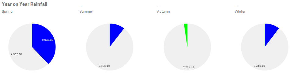
So, what, exactly, is a Pie-Gauge anyway? It is a gauge because it is representing a KPI - one value versus a target value. However it solves one issue with gauges in that I don't ever have to worry about the scale. This is especially good when I may have several KPIs. Pie-gauges are all about ratios.
Like all pie charts, it is a part-to-whole comparison. In this case, there are always three segments, two of which are mutually exclusive, making up the whole.
The first segment represents the amount by which we have fallen short of the target. The second segment represents the lower of the target value or the actual value. The third segment represents the amount by which we have exceeded the target.
We can see that the whole is therefore the higher of the target or the actual value. We can also see that the first and third segments cannot exist together - we can't fall short and exceed the target at the same time.
The positioning of the segments is important. The first segment must be to the left of the top of the pie, and the third segment must be to the right - signifying below and above target.
The great thing about these gauges is that they will work no matter by how much we have fallen short or exceeded the target - they are always a part-to-whole comparison. Unlike gauges with fixed axes, they will just work.
The really important thing to grasp is that the actual % above or below target is not important! It is the representation of the ratio that is important. It is whether we are above or below target, not by how much, that we are representing.
The three values can be very easily calculated using Qlik's RangeMin and RangeMax functions.
The first segment is:
RangeMax(Sum(Actual)-Sum(Target),0)
The second segment is:
RangeMin(Sum(Actual),Sum(Target))
The third segment is:
RangeMax(Sum(Target)-Sum(Actual),0)
In QlikView, we can have these as three separate expressions in a Pie chart. In Qlik Sense, we can only have one expression so I use a ValueList dimension and an expression like this:
If(ValueList(' ', ' ', ' ')=' ',
RangeMax(Sum(Actual)-Sum(Target),0)+0.001,
If(ValueList(' ', ' ', ' ')=' ',
RangeMin(Sum(Actual), Sum(Target))+0.001,
RangeMax(Sum(Target)-Sum(Actual),0)+0.001
))
Note the +0.001 on each - that stops Qlik Sense displaying the "chart contains zeros" message. The spaces in the value list are there just to stop additional text being displayed on the Pie.
The color can then be calculated like this:
If(ValueList(' ', ' ', ' ')=' ',
LightBlue(),
If(ValueList(' ', ' ', ' ')=' ',
RGB(240,240,240), LightGreen()
))
Have fun with Pie-gauges.
Stephen Redmond is author of Mastering QlikView, QlikView Server and Publisher and the QlikView for Developer's Cookbook
He is CTO of CapricornVentis a Qlik Elite Partner.

No comments:
Post a Comment
Note: only a member of this blog may post a comment.