| Paradigm (from http://dictionary.com): - a framework containing the basic assumptions, ways of thinking, and methodology that are commonly accepted by members of a scientific community. - such a cognitive framework shared by members of any discipline or group. |
Following a recent demo of quite a well know data preparation tool, I was left thinking to myself, "well, that was confusing". The workflow itself was quite straightforward, in that it was an extraction of a reasonably straightforward dataset and then creating and evaluating a machine learning process. But there was just so much visual information on the screen, with so many icons, sub-processes and connections going all over the place, that it was just difficult to understand what was going on.
So, took to LinkedIn and Twitter on the subject and asked:

It isn't.
The problem is that there is no shared paradigm about it. Well, there is a certain amount - for example, we tend to go left-to-right (until we don't) - but there is enough different options available to users to make one user's outputs very different to another's.
Let's have a look at a very simple example from Pentaho Data Integration (you might recall that I wrote an eBook some time ago on using Pentaho to prepare data for Qlik Sense):
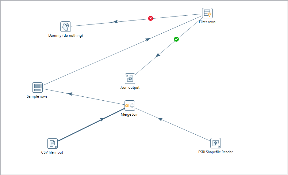
Pentaho affords the user the option to have their flows going in whatever direction they want - up, down, left, right, diagonal - and flows can cross over. I can make as messy an interface as you want - although, hey, I can understand it and that is all that matters, right?
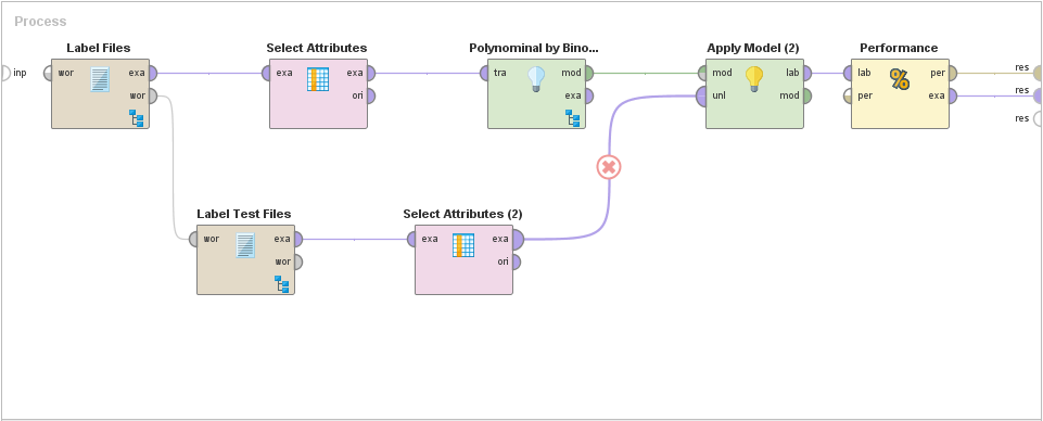
Even on a system that enforces a left-to-right paradigm, for example RapidMiner, still allows the user a lot of freedom. For example, this data flow:
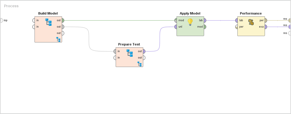
This is nice and simple, flows from left-to-right. Looks great, right? But what about now:
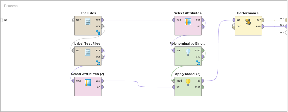
Functionally, it's the exact same flow, but visually different enough from the first so as to look like a different flow to different users. How about now:
Again, it is the same flow, just with processes grouped. Most of the ETL tools will allow us to "tidy" the display by grouping multiple icons and flows into a sub-process. Different users may group in different ways.
Of course, when you write scripts, then you are even more free to do what you will. We can name variables whatever way we want. We can create sub routines and functions, classes and methods (depending on the language!), whatever we want. However, it does seem, and maybe this is just me, to be somewhat more controllable.
Script has a top-to-bottom flow. Even when using lots of functions, within those functions the code always flows from top-to-bottom. The syntax of the language is itself a constraint that enforces something that is more readable. Because the code is essentially structured text, we can even automate an enforced coding standard - including commenting.
This ability to automate the coding standard is actually a strength derived from many years of paradigm building. Scripting, in whatever language, has paradigms that developers quickly learn to follow.
Over time, the visual tools may develop those paradigms, but I am not sure that they can.
Stephen Redmond is a Data professional. He is author of Mastering QlikView, QlikView Server and Publisher and the QlikView for Developer's Cookbook