
If you haven't realized it, there are potentially thousands of uses of this chart.
During the week, the very clever Matthew Crowther, who runs the QVDesign blog, tweeted this example:
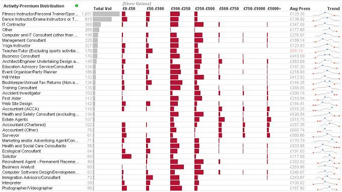
Here he is using the "Redmond" to show premium distribution.
Today, I build a "Redmond" to show sales distribution across a companies main products:

If you haven't downloaded a copy of the original example yet, it is available from the QlikView Community.
So, here is the challenge: What can you do with a Redmond Profile Chart?
Stephen Redmond is CTO of CapricornVentis a QlikView Elite Partner. We are always looking for the right people to join our team.
Follow me on Twitter: @stephencredmond
No comments:
Post a Comment
Note: only a member of this blog may post a comment.