Thursday, 20 December 2012

Powerful Preceding

The preceding load functionality in the QlikView load script is extremely powerful for transforming data.

Many developers will never use it.  They simply use SQL queries to format their data and transform it.  Others may use it - but accidentally.  They turned the "Preceding Load" check box on in the "Select" data wizard during training and have never turned it off.  They get a simple SQL statement like:

SQL SELECT * FROM TableName;

And barely notice that there is a QlikView Load statement sitting above it.

This is brilliant though - just because it is a QlikView statement.  This means that we can use the great set of QlikView functions within this statement.  From the simple Year or Month, to parse a date, to the most useful ApplyMap - one I use all the time.

Even there, we are not finished.  We can add additional Preceding Load statements above other Preceding Load statements!

Another thing that some people may not realize is that Preceding Load statements can include their own WHERE and GROUP BY clauses.  This is really powerful.

For a quick example, I want to load in a list of Father Ted episode from:

http://en.wikipedia.org/wiki/List_of_Father_Ted_episodes

I start off with the normal QlikView file wizard:


I see an immediate problem here.  There are 3 columns but there is a 4th column of data wrapped onto the next row.  The simple QlikView script to load this will look like this:


LOAD F1 as Episode, 
     Title, 
     [Original airdate]
FROM
[http://en.wikipedia.org/wiki/List_of_Father_Ted_episodes]
(html, codepage is 1252, embedded labels, table is @3);


Looking at this in a table box shows me the problem.


I need to come up with a simple rule - if the Episode field is numeric, that line has Episode, Title and Original airdate.  If not, that line has the description.  I can then re-craft my load like this:


Load
if(IsNum(Episode), Episode, Previous(Episode)) As Episode,
if(IsNum(Episode), Title, Previous(Title)) As Title,
if(IsNum(Episode), [Original airdate], Previous([Original airdate])) As [Original airdate],
if(IsNum(Episode), Null(), Episode) As Description;
LOAD F1 as Episode, 
     Title, 
     [Original airdate]
FROM
[http://en.wikipedia.org/wiki/List_of_Father_Ted_episodes]
(html, codepage is 1252, embedded labels, table is @3);


Here I have put a Preceding Load on top of the original.  I am checking if the Episode value is numeric.  If it is, I use that value for Episode and use Title for Title and Original airdate for Original airdate.  I use the Null() function to create a blank Description field.  If the Episode field is not numeric, I then grab the Previous values for Episode, Title and Original airdate and use the new text value of Episode as my description.  This leaves me with:


Now, I can see that I have the first 3 values populated on each row, but Description only on every 2nd row. I am going to make one last tweak to my code:


Load
if(IsNum(Episode), Episode, Previous(Episode)) As Episode,
if(IsNum(Episode), Title, Previous(Title)) As Title,
if(IsNum(Episode), [Original airdate], Previous([Original airdate])) As [Original airdate],
if(IsNum(Episode), Null(), Episode) As Description
Where Not IsNum(Episode);
LOAD F1 as Episode, 
     Title, 
     [Original airdate]
FROM
[http://en.wikipedia.org/wiki/List_of_Father_Ted_episodes]
(html, codepage is 1252, embedded labels, table is @3);


By adding a Where clause to the Preceding Load, I am now excluding the lines that do not have the Description.  My mind slightly boggles at this because I am not sure how I would achieve this quickly and easily using a SQL Query.

Can you think of any ways where a Preceding Load might save you multiple steps elsewhere?


Stephen Redmond is CTO of CapricornVentis a QlikView Elite Partner. We are always looking for the right people to join our team.
Follow me on Twitter: @stephencredmond

Wednesday, 14 November 2012

List boxes are all right

Every QlikView demo that I have seen has the list boxes - the primary "Qlik" object in QlikView - on the left-hand side of the screen.  I have seen sample documents from several QlikView partners in the past - and they have the list boxes on the left-hand side of the screen.

They are all wrong!

The correct place to put the QlikView list box is on the right-hand side of the screen.

In CapricornVentis, we have been doing this now for several years.  When delivering designer training courses, we tell all the delegates that this is the correct side of the screen to place list boxes.  We have several customers who have adopted this as their corporate standards because they believe that we are correct.  We are.

Why are we correct?  There are two simple reasons - one of which is "design 101", the other is more subtle.

First, we should note that while list boxes are the primary "Qlik" object, they are not the primary information delivery object.  That role goes to charts.  List boxes are secondary.

The "101" reason is a basic tenet of screen design.  The top left-hand side of the screen is the primary piece of real-estate.  This is where the eye immediately heads when you open a page.  Therefore you need to put your primary information display element - charts - starting in the upper-left corner.  Not list boxes, and especially not logos!

The subtle reason goes with the use of a right-handed mouse (the majority of users).  In a very subtle way, right-hand list boxes suit their eye and their use of the mouse.  They do not have to "cross over" the data with the mouse pointer.

This point is so subtle that it wouldn't, in itself, be strong enough to back up my argument.  However, the advent of mobile technology - especially tablets - adds some more backbone to this argument.  The reason being that the user is not just pushing the mouse across the data, they are using their whole hand - which blocks the data!

Look at this image:


Here, the iPad user is about to make a selection on a list box.  But note!  His hand is covering the data.  To see the change that has happened after he has made the selection, he needs to move his hand out of the way.  To make another selection, he needs to move his hand back in.  Back-and-forth, back-and-forth.

Consider now this image:


The user, while comfortably resting his hand on the edge of his tablet, it able to make multiple selections with ease.  The data changes before his eyes.

List boxes should go on the right-hand side.


Stephen Redmond is CTO of CapricornVentis a QlikView Elite Partner. We are always looking for the right people to join our team.
Follow me on Twitter: @stephencredmond

Thursday, 1 November 2012

Fix a Windows 8 boot issue

This is a little off topic, but I thought it would be useful to post here.

I recently updated my home PC from Windows 7 to Windows 8.  The PC was only a month old, so it made sense to take up the low price offer.

After a couple of days of normal working, it suddenly failed to boot.  The error was saying that there was a missing operating system or the disk had failed.  However, the hard disk diagnostics were saying that there wasn't a problem.

I eventually worked out that this message was actually a red herring.  The PC has the newer UEFI bios so it should attempt to boot directly into the Windows boot manager.  The error I was getting was actually because this wasn't happening and the startup options were falling through (down past CD, USB, etc.) to the legacy disk option.  This obviously wouldn't work because it wasn't set up for it.

Having identified the problem, I then tried to get online and find the fix.  Unfortunately, this wasn't as easy as I expected so this is why I am posting here so that others may find it on Google.

The usual type of fix for this were to boot off the Windows CD and run the Command Prompt and run a command like this:

BCDedit

However, this returned the error:

The boot configuration store could not be opened

This was quite strange.  I could see all the files on my drive and could see that all the partitions that were supposed to be there were there using DISKPART.

Other suggestions were to run this set of commands:


Bootrec /fixmbr
Bootrec /fixboot 
Bootrec /rebuildbcd


One posted suggested that this worked 100% of the time.  It didn't.  I got the error:

The requested system device cannot be found

Other sites suggested that I should make the System partition (the 100MB partition with no drive letter that Windows 8 uses  to store the boot files on a UEFI system) Active using DISKPART.  However, when I tried this I was told that my drive was not an MBR - is isn't, it is GPT.

At this stage, I thought that I should just cut my losses and try a refresh install.  However, when I chose this option, I got the error:

The drive where Windows is installed is locked

Very curious.

Finally found a site that suggested using:

BCDBoot c:\Windows

Now this didn't work either, I got:

Failure when attempting to copy boot files

There was an option to use a /S to specify where to copy the boot files to.  However, I wanted them to be copied to the system partition which doesn't have a drive letter.  So, I used DISKPART to assign the letter Z to volume:

ASSIGN LETTER=Z

Then I could use BCDBoot to run this:

BCDBoot c:\Windows /s z: /f: UEFI

Lo and behold, my system now boots!  To say that I am a bit frazzled, after a couple of days of family members looking at me expecting me to be able to fix this issue, would be a major understatement.

I hope this helps someone.


Stephen Redmond is author of Mastering QlikViewQlikView Server and Publisher and the QlikView for Developer's Cookbook
He is CTO of CapricornVentis a Qlik Elite Partner.
Follow me on Twitter   LinkedIn

Tuesday, 23 October 2012

Introducing QlikSecure

CapricornVentis are using the occasion of the QlikView Business Discovery World Tour event in London to launch QlikSecure.

Imagine that you could login to QlikView using a password that was very easy to remember, easy to enter on a small smartphone screen, and at the same time is extremely secure?  Instead of having to remember a 20 character password - including capitals, numbers and punctuation - you could just click on some images that you recognize instead.

QlikSecure is built on two technologies from UK based MHInvent, a company founded by Mike Hawkes, a well known and respected figure in the mobile data industry.

Eagle Enhanced Authentication allows the user to quickly and easily login with easy to remember credentials based on images.  It includes some neat tricks such as varying the location of the images - so that someone looking over your shoulder can't track where you are typing - and varying the images themselves (it could by 4 different images of the same person) to further make casual observation difficult.  Each image is subtly different each time, with slightly different pixels, and that difference is used as part of the encryption algorithm.

The Hawk Secure Communications server enables the secure connection between the end user and the QlikView server.


Stephen Redmond is CTO of CapricornVentis a QlikView Elite Partner. We are always looking for the right people to join our team.
Follow me on Twitter: @stephencredmond

Thursday, 18 October 2012

How can you use the Redmond Profile Chart?

Last week, I introduced the Redmond Aged Debt Profile Chart.


If you haven't realized it, there are potentially thousands of uses of this chart.

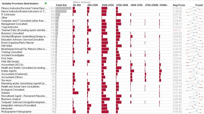
During the week, the very clever Matthew Crowther, who runs the QVDesign blog, tweeted this example:


Here he is using the "Redmond" to show premium distribution.

Today, I build a "Redmond" to show sales distribution across a companies main products:


If you haven't downloaded a copy of the original example yet, it is available from the QlikView Community.

So, here is the challenge:  What can you do with a Redmond Profile Chart?


Stephen Redmond is CTO of CapricornVentis a QlikView Elite Partner. We are always looking for the right people to join our team.
Follow me on Twitter: @stephencredmond

Friday, 12 October 2012

Introducing the Redmond Aged Debt Profile Chart

I was working with a client recently and one of the requirements was to have a report showing aged debt by client.  Most people who have worked as report developers will be familiar with this type of chart - showing the debt values broken down into buckets, quite often of 30 days.  Something like this:


This type of chart is very straightforward to produce in QlikView and something that we would do quite regularly.

While I was building it, I was thinking to myself, "this isn't very visually appealing, there must be something that I can do to enhance it".

So, this is what I did - get rid of most of the numbers, and replace them with blocks.


The first column here is essentially a bar chart.  This gives the user and immediate view of the relative sizes of the debts.

The next columns show the relative size of the values within the buckets.

With the two visualizations within the one chart, the user - probably a credit controller - can scan the page and see where the most effort needs to be made to chase debt.  Of course, being a QlikView Straight Table, each of the buckets is independently sortable so I can quickly find out all of my clients who have most of their debt in the higher buckets.

I have had a good scout around the internet (via Google, of course) and haven't come across anything similar to this for this purpose.  Therefore I am going to claim it for myself and get all the glory ;-)

I would love to hear people's thoughts about this chart and ideas about where else it might be applied.

There is an example QlikView document showing how the chart is built available for download from the QlikView Community.


Stephen Redmond is CTO of CapricornVentis a QlikView Elite Partner. We are always looking for the right people to join our team.
Follow me on Twitter: @stephencredmond

Fix for an annoying display issue in QlikView

I have had this problem for a while, but I was able to work around it so I didn't worry too much.  I even raised it with QlikView support at one stage but they weren't able to help because they could not replicate it.  They did tell me that some other people had reported the issue, so hopefully this post will help some of you out.

The issue appears in several dialogs, but it mainly irked me in the "Number" properties.


You can see that the "Symbol" and "Thousands" entry boxes are being obscured by the "ISO" and "System" buttons and the right hand side goes off the edge.  The number dialog for List boxes and Table boxes was similar except it was the "Show in Percent (%)" option being obscured by the "Document Default" buttons.

It was really just an annoyance because I could get around it.  So, after living with this issue for a while, I finally got around to Googling it this morning.  I came around this article by RL Vision:

http://www.rlvision.com/misc/windows_7_font_bug.asp

Could it be that simple?  Just make 3 tweaks to the registry?  So I did it.  Changed the "F" to and "E" in the 3 locations and:


TaDa!  All is right again.  Simple as that.

I hope this helps if you have this problem.  For me, it wasn't just confined to QlikView, so perhaps you might recognize it in other apps that you come across.


Stephen Redmond is CTO of CapricornVentis a QlikView Elite Partner.  We are always looking for the right people to join our team.
Follow me on Twitter: @stephencredmond